
Meetup
Meetup is focused on creating and joining local communities. It brings people with similar interests together and is used globally.
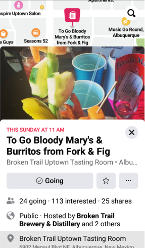
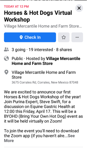
Events
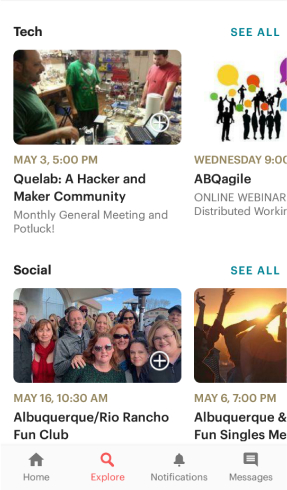
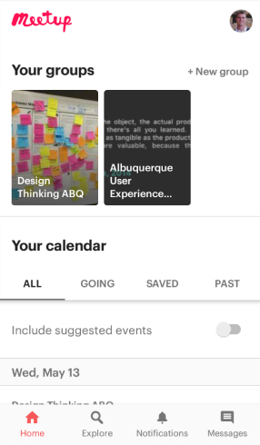
Groups & Calendar
- Strengths
- Has numerous subdivided categories
- Provides upcoming event notification
- Allows users to browse as guests
- Weaknesses
- Interests cannot be added from mobile
- Calendar feature can become cluttered even with a single group
- Saved meetups feature somewhat obscure
- Opportunities
- Expand group recruitment through social networking sites
- Improve calendar
- Highlight saved meetupsS